Overview
Google Data Studio is a tool engineers and analysts can use to visualize and present data. It is the equivalent of using Excel or Google Sheets to generate graphs and plots but for data in different data stores (eg. Google BigQuery).
I became acquainted with Data Studio through work. I had a large dataset and results from a very large processing job that I wanted to turn into a report. The data was in Google BigQuery, a datawarehouse on GCP. In the past, my workflow may have been to:
- Extract the data I care about it, put it into a Google Sheet and generate diagrams.
- Extract the data to csvs, and use a jupyter notebook to visualize the data
Both solutions are fine. I have used them successfuly in the past. But I felt like there was something better and more convenient. When digging into the integrations for BigQuery, I saw you could use Google Sheets or Data Studio to visualize the data.
The Google Sheets integration worked but wasn’t easy to deal with. I tried Data Studio and ended up loving it.
Data Studio + BigQuery
Like many data visualization tools, you just link your data source with the tool. Since both BigQuery and DataStudio are google products, integrating them was seamless.
Once you integrate the data store, you can easily create line charts for time-series data, pie charts for distributions and more.
To showcase this, I will guide you through how I made a visualization for Hacker News Data available on BigQuery!
Analyzing Hackernews data with Data Studio
Add the hackernews bigquery data to Data Studio
- Navigate to google.datastudio.com
- Click on add a data source in the top left
- Select a BigQuery dataset
- If you don’t have a Google Cloud Platform project for this, create one
- Select your project for billing purposes.
- Select public datasets
- Select the
hackernews.fulltable
Create some toy visualizations
- Create a new DataStudio Report
- Click add data. Add the hackernews
fulltable to the report. You can now use it for visualizations. - View the table schema to see what types of data is available (Eg. posts, comments, submitters, etc.)
The user interface for creating visualizations is quite nice and intuitive. Left as an exercise to the reader.
Some items I investigated were:
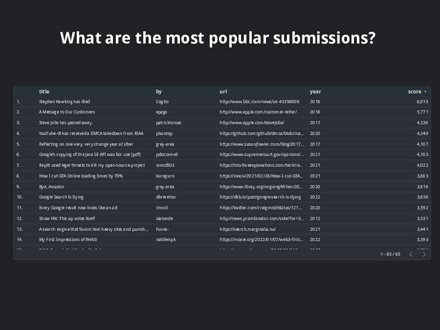
- most popular posts
- how often posts are made
- most common websites for submissions
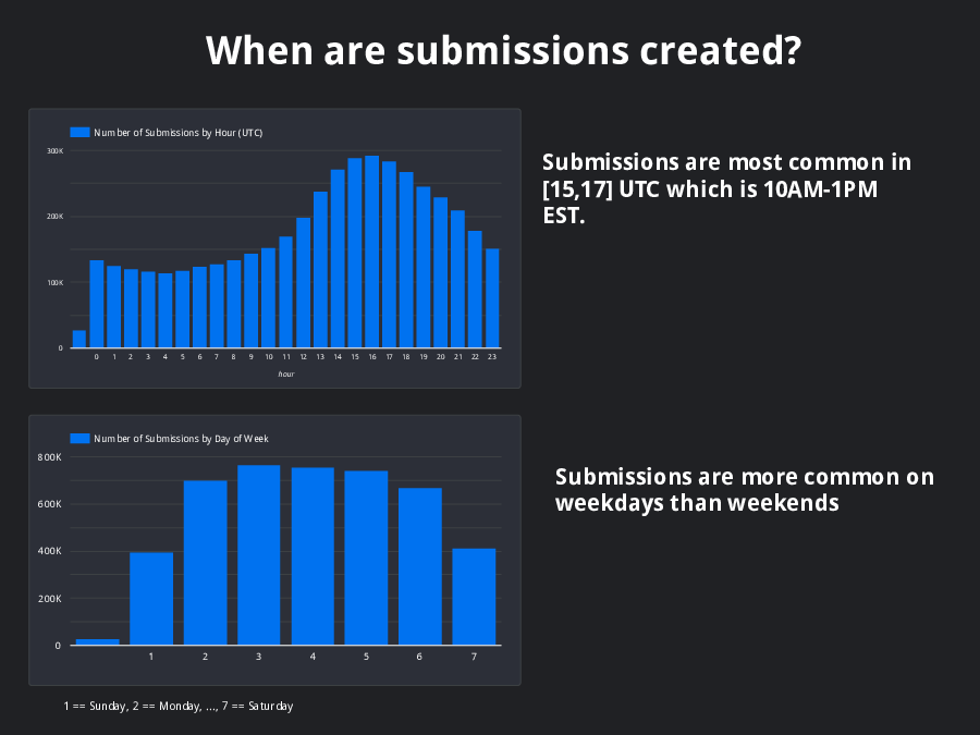
- when are submissions created
- …
Cool things about Data Studio
- You can create your visualization and share it with others! Share it like a google doc.
- The datastore you use may be updated periodically. Data Studio has the ability to periodically refresh or manually refresh the visualizations to ensure they are always up to date. For reports on static data, pick a high period. If you want up to date visualizations, you can select a period in the minutes.
- You can export your visualization to a PDF for sending via email.
- For those visualizing machine learning workflows, you can use the pivot table visualization to generate a confusion matrix!
- Data Studio is free, but you may incur costs based on your datastore. If using bigquery, be aware that every time your data is refreshed you pay query costs.
My example dashboard
To view the live dashboard, click here.
To view the exported pdf, click here.
I have also include all images embedded below.