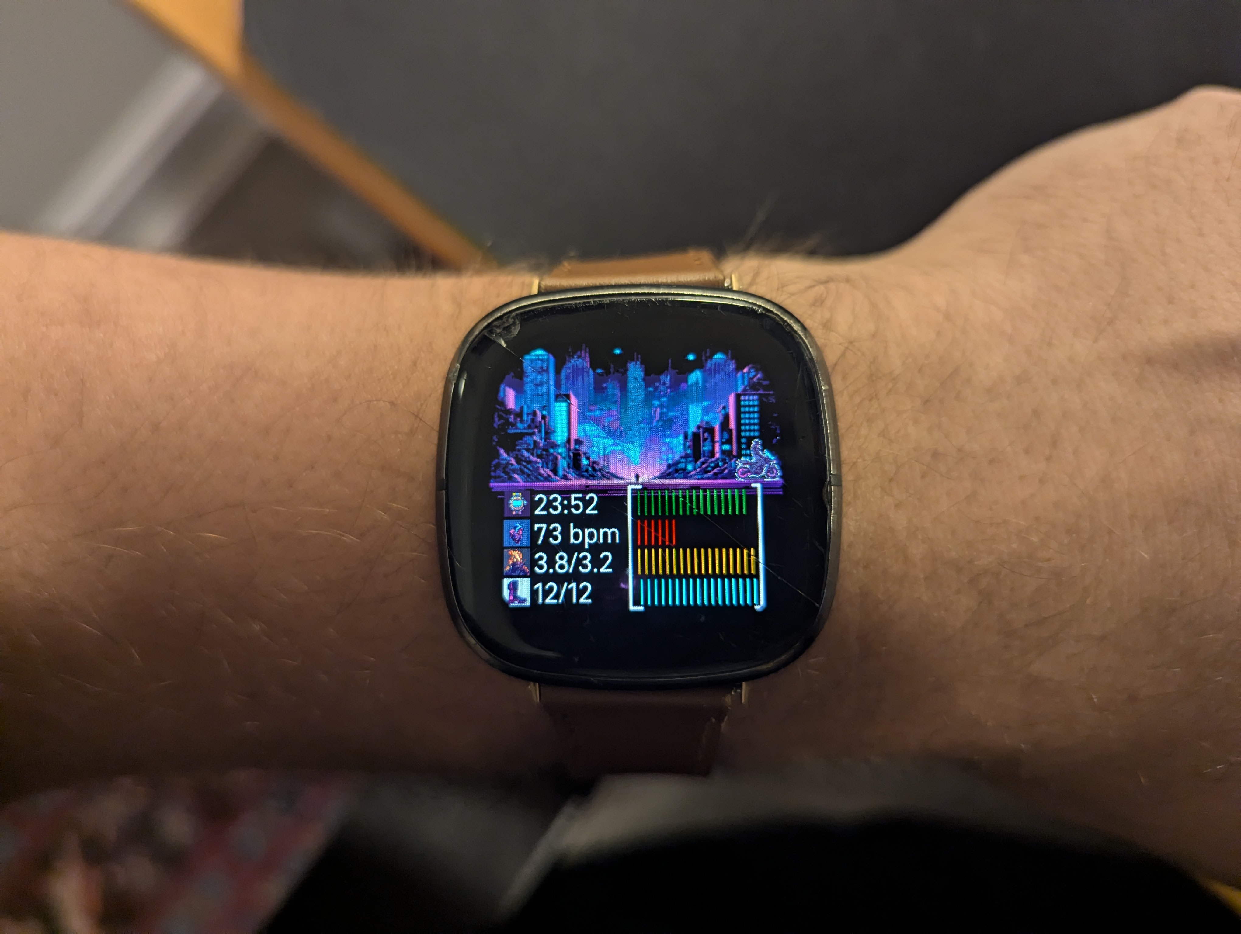
making a fitbit watchface
disclaimer: this is a dev log, not polished.
why
I was reading Master of Doom about ID Software and the legends John Romen and John Carmack.
The author describes the game-making process and how new engine technology designed
by Carmack enabled new games designed by Romero. This made me think about my
meager experience in graphics, and UI in general.
I mostly work on backend and infrastructure and wanted to do a toy project. Somehow, I realized that the clockface for my fitbit watch could be a fun thing to do. Pomodoros have also been the talk of the town on Toronto tech twitter, so I wanted to use that to get more done.
Thus began my journey to make a custom clockface for my fitbit.
dev notes
- Getting the necessary tools up on linux was fine. The only issue that the fitbit simulator only works on windows and osx. I am debugging against my actual fitbit sense which is actually not too bad
- to debug against your actual device, you have to connect the fitbit to wifi
- then, when you when
npx fitbit, runningbiwill build and install the custom clockface on your device - all of my UI elements leverage hardcoded x and y percentages for the elements in html. this is crude but also easy to debug and tweak. I know minimal css and html, flexbox was the extent of my alignment knowledge
- I like the idea of a graphic that changes as the day progresses
- instead of having a sprite move across the cityscape, make the city more dynamic and take up the full screen? Have the sprite move along a path that changes
- use colours to indicate progress on the different metrics (eg. reg when my bpm is high)
iterations
iteration 1
- I wanted to get a background image + the time on the screen.
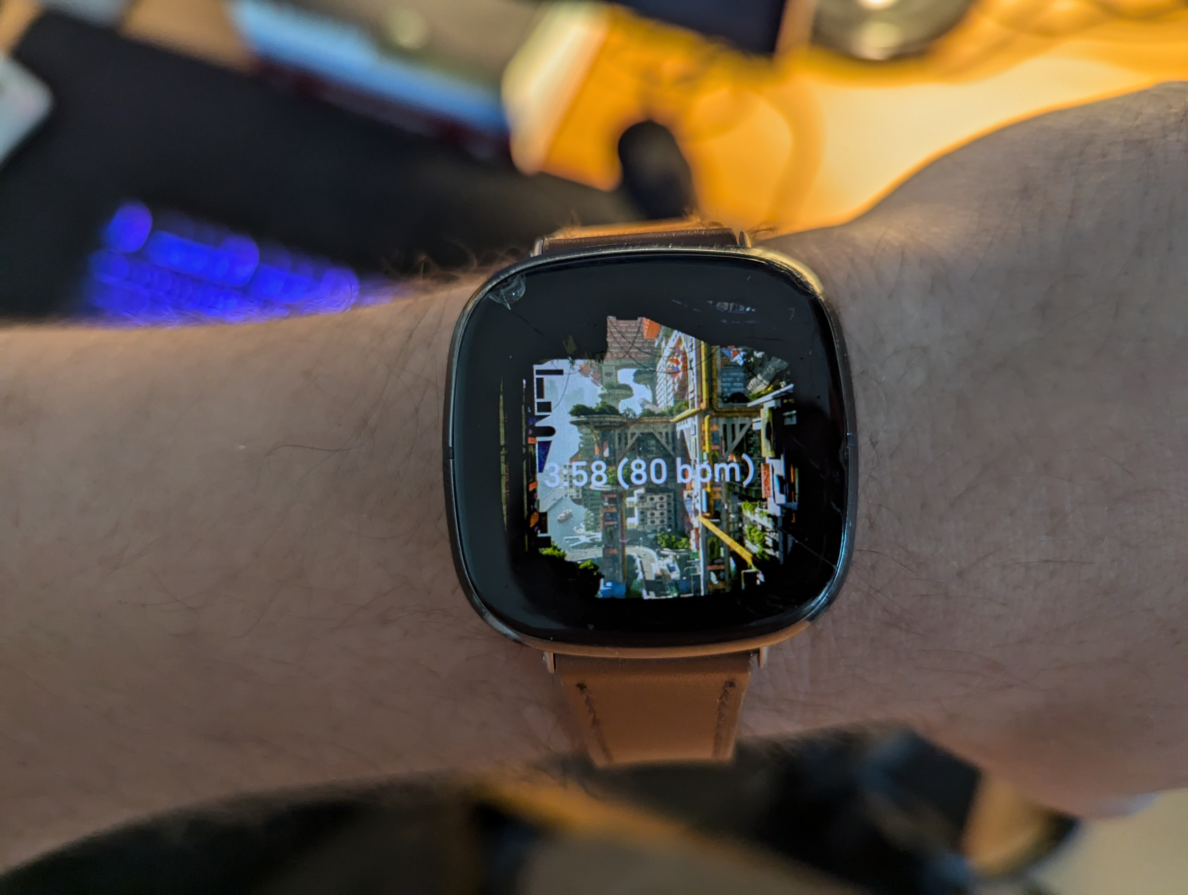
iteration 2
- started computing different metrics I care about. The 4 I converged on were
- time
- bpm
- calories/ calorie goal
- steps / step goal
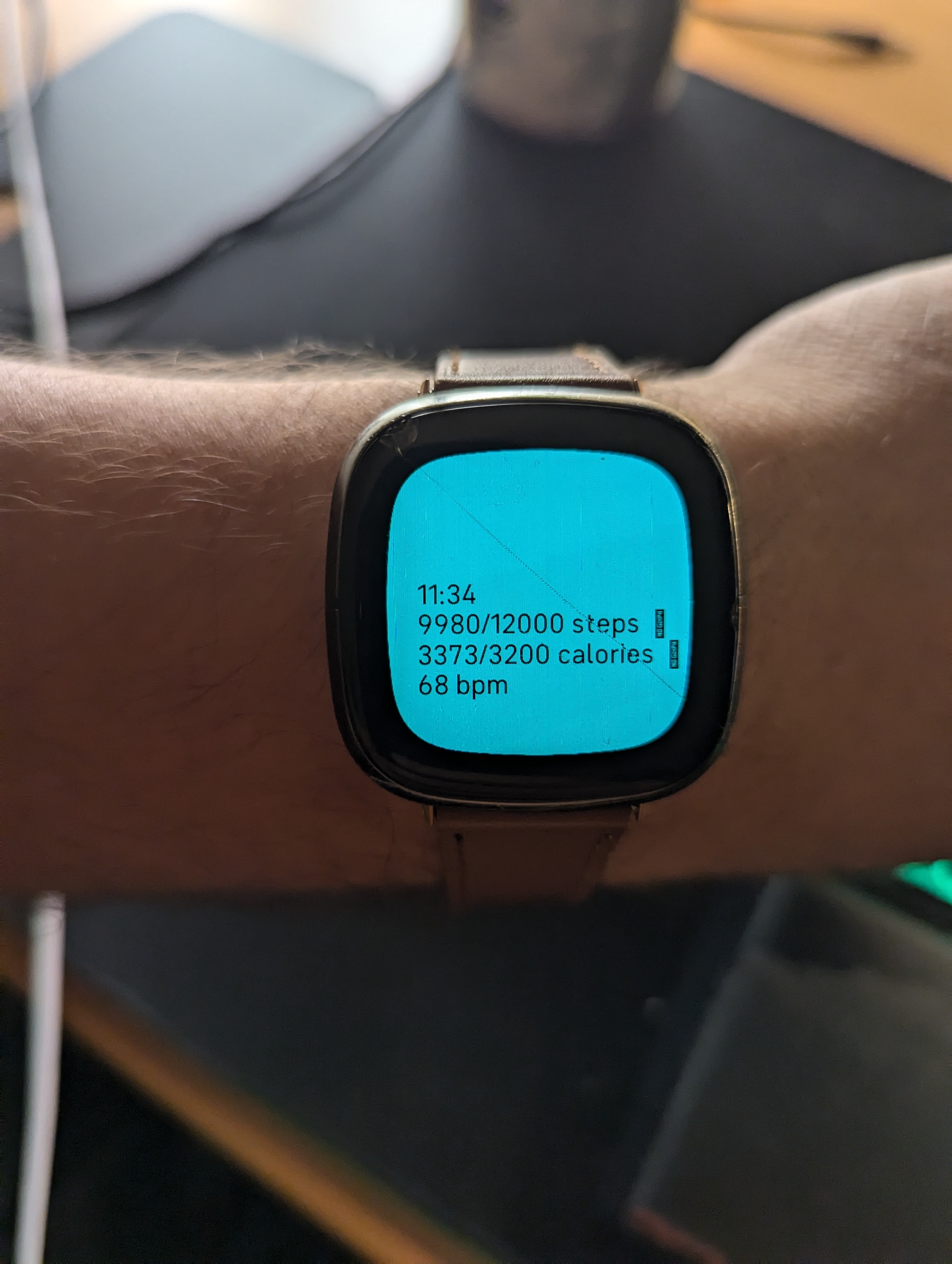
iteration 3
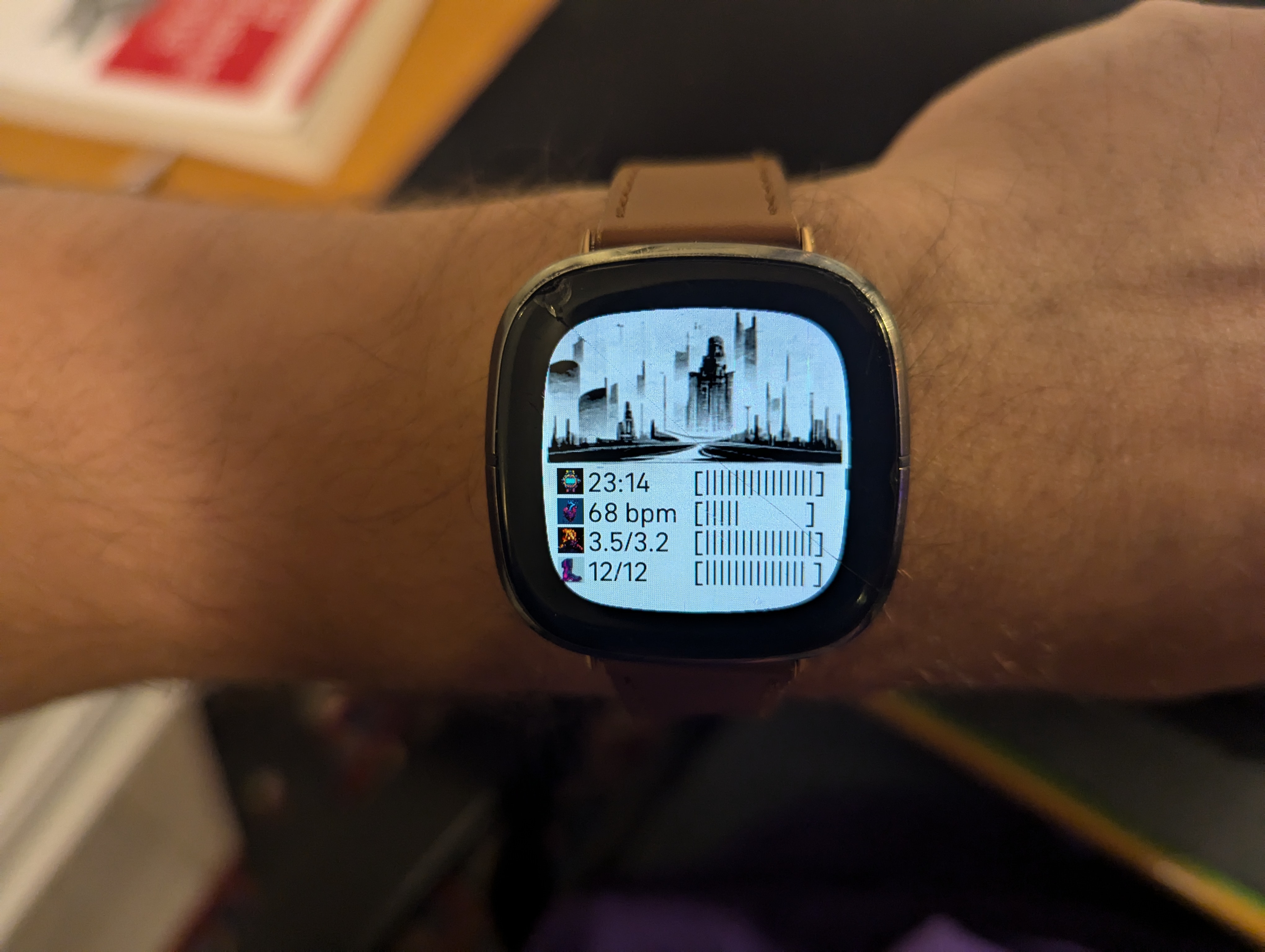
- I wanted a cooler color scheme with a background image. Went with a BW image of a cityscape.
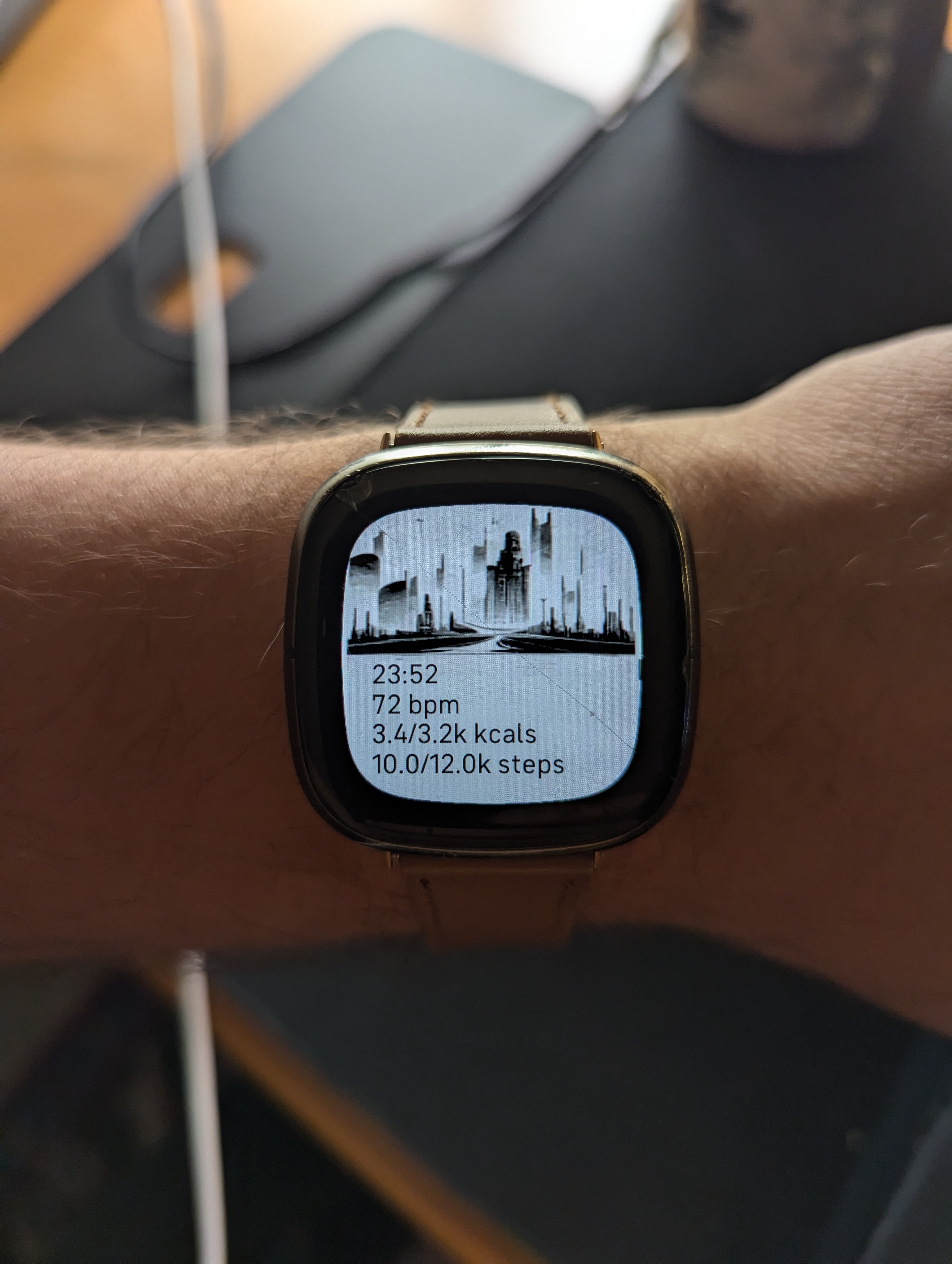
iteration 4
- I also added htop like progress bars for the different stats. Fitbit does not have monospace fonts which makes it painful to align the bars
iteration 5
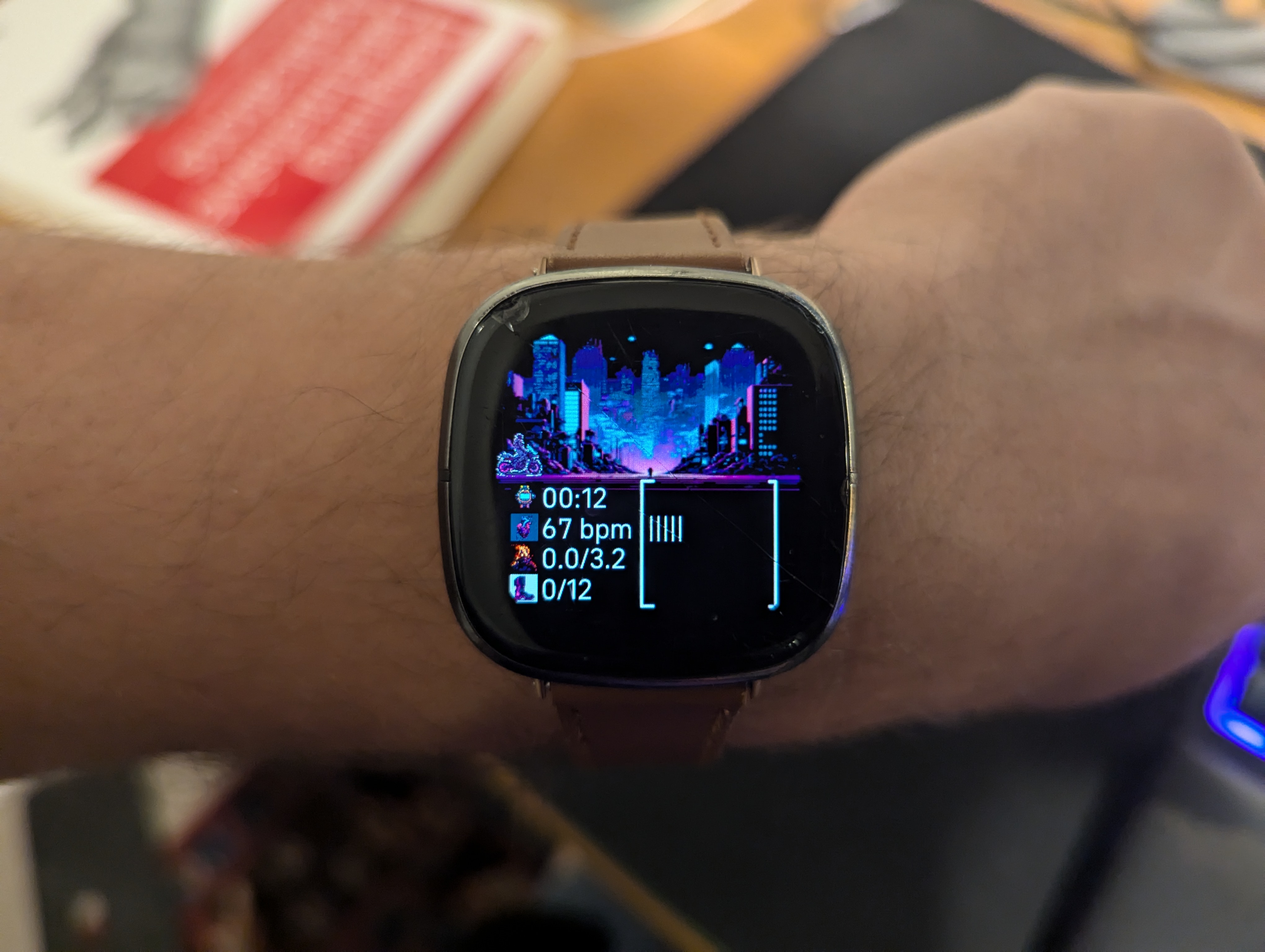
- Swapped the cityscape image
- To fix the alignment issue, I used svg lines instead of text. This made it easier to align the progress bars
- I also added an sprite image of a motorcycle dude that moves across the screen based on the time. thanks midjourney
iteration 6
- Add colors to the different progress bars.
